Embracing the Latest Color Trends for Commercial Spaces in the 2020s
Understanding the Impact of Color in Commercial Spaces
In the world of commercial design, color plays a crucial role in shaping the atmosphere and influencing customer behavior. As we move through the 2020s, embracing the latest color trends can transform commercial spaces into vibrant environments that attract and retain customers. With the right palette, businesses can enhance their brand identity and create memorable experiences for visitors.
Color psychology suggests that different hues can evoke specific emotions and reactions. For instance, warm colors like red and orange can stimulate appetite, making them ideal for restaurants, while cool shades such as blue and green promote calmness, perfect for spas or wellness centers.

Emerging Color Trends of the 2020s
As we progress through this decade, several color trends are emerging that can redefine commercial spaces. These trends reflect shifts in consumer preferences and global events, offering businesses an opportunity to stay current and appealing.
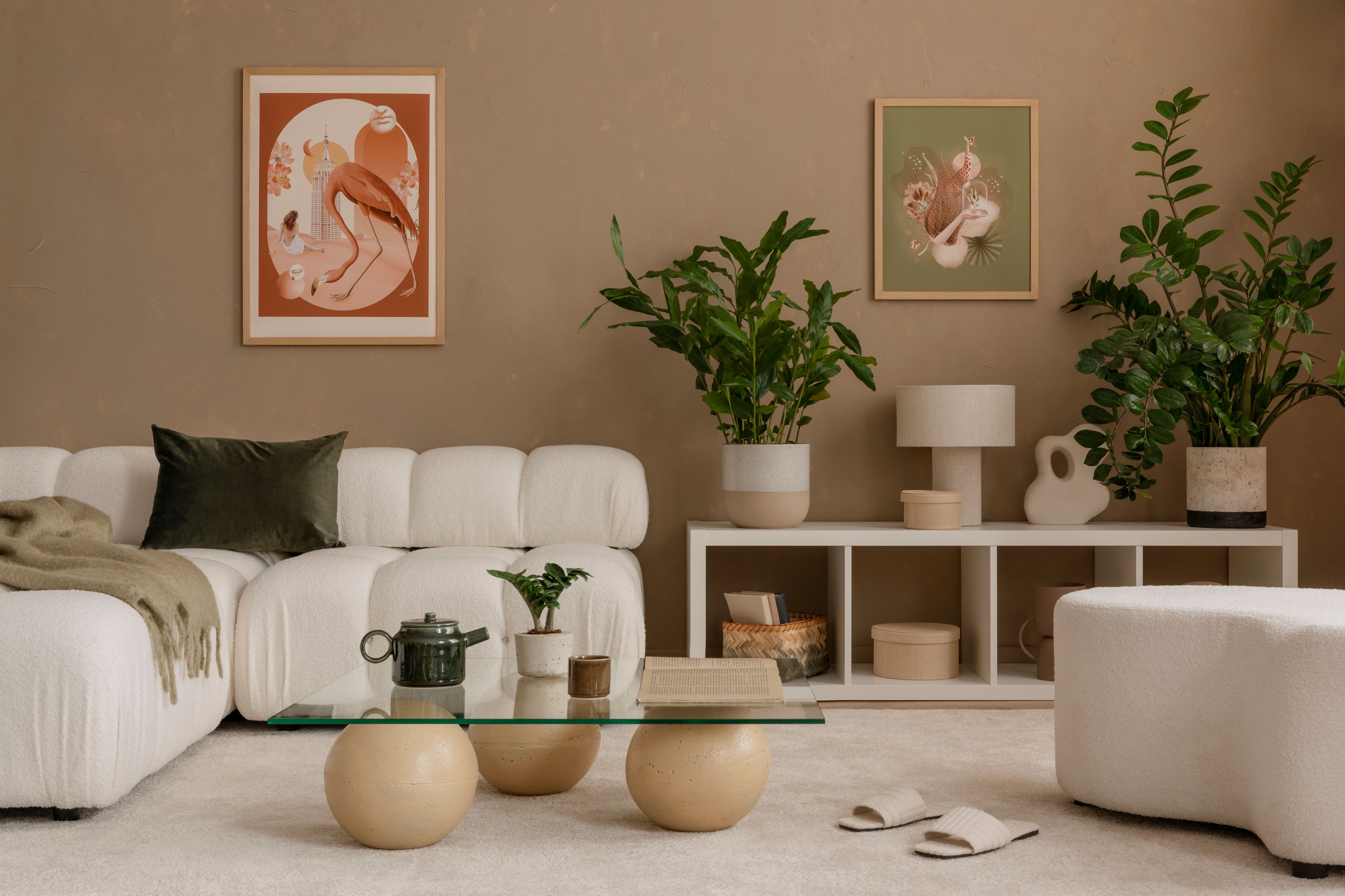
Earthy Tones: With a growing focus on sustainability and nature, earthy tones like terracotta, olive green, and clay are becoming popular. These colors bring warmth and a sense of grounding to spaces, making them particularly suitable for eco-friendly brands or businesses wanting to convey a natural vibe.
Bold and Vibrant Colors
The 2020s also see a resurgence of bold and vibrant colors. Bright yellows, rich blues, and deep purples are being used to create eye-catching spaces that exude energy and creativity. These colors are perfect for tech companies or creative agencies looking to inspire innovation and originality.
- Yellow: Known for its uplifting qualities, yellow can brighten up any space and is ideal for areas where you want to encourage conversation and interaction.
- Rich Blue: A versatile color that can add sophistication and depth to a room, suitable for corporate offices or luxury brands.
- Deep Purple: Associated with creativity and mystery, perfect for spaces that wish to inspire curiosity and imagination.
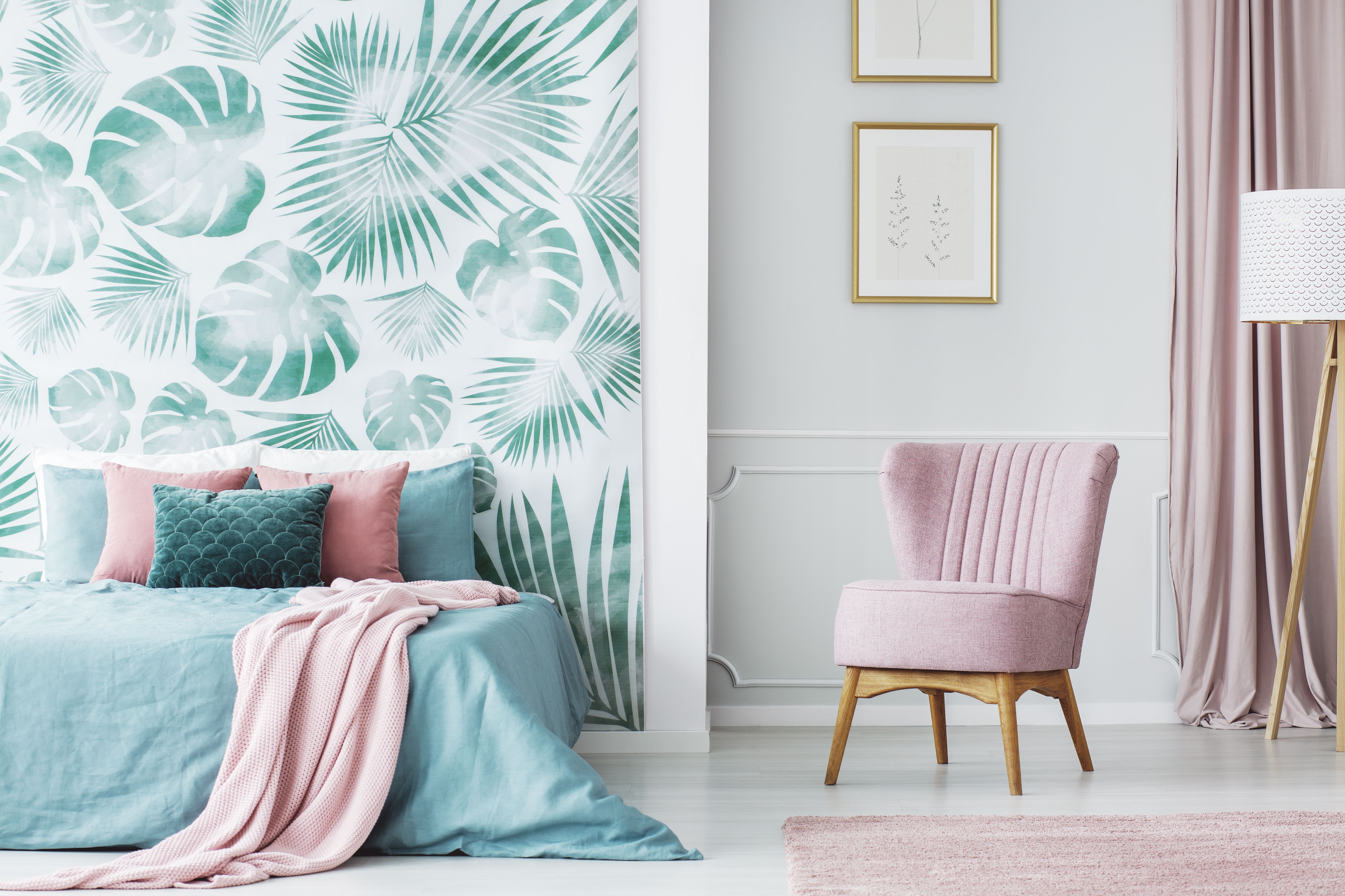
The Subtle Power of Pastels
Pastel colors have made a comeback, offering a softer alternative to the bold palettes. These muted tones provide a calming effect, making them perfect for environments where relaxation is key. From pastel pinks to mint greens, these colors can subtly enhance a space without overwhelming it.
Incorporating pastels can be particularly effective in retail settings or boutique hotels where a serene ambiance is desired. By pairing pastels with natural lighting and minimalist design elements, businesses can create an inviting and tranquil environment.
Implementing Color Trends Effectively
When integrating the latest color trends into a commercial space, it's essential to consider the overall brand message and target audience. Here are some tips for effectively using color:
- Balance: Use bold colors sparingly to avoid overwhelming your space. Combine them with neutrals to maintain balance.
- Accent Walls: Create focal points using accent walls painted in trendy hues to draw attention without overcommitting.
- Textures: Pair colors with different textures to add depth and interest.
By thoughtfully embracing color trends, businesses can not only modernize their spaces but also cultivate an environment that resonates with their clientele. As we continue through the 2020s, staying attuned to these evolving trends will be key in maintaining a competitive edge in the commercial sector.