Transforming Spaces: Latest Color Trends for Commercial Areas in the 2020s
Embracing Vibrant Hues
The 2020s have ushered in a bold era of color trends that are transforming commercial spaces. As businesses aim to create inviting and dynamic environments, the choice of color has become a crucial element in interior design. From offices to retail spaces, the right color palette can significantly enhance mood, productivity, and customer engagement.
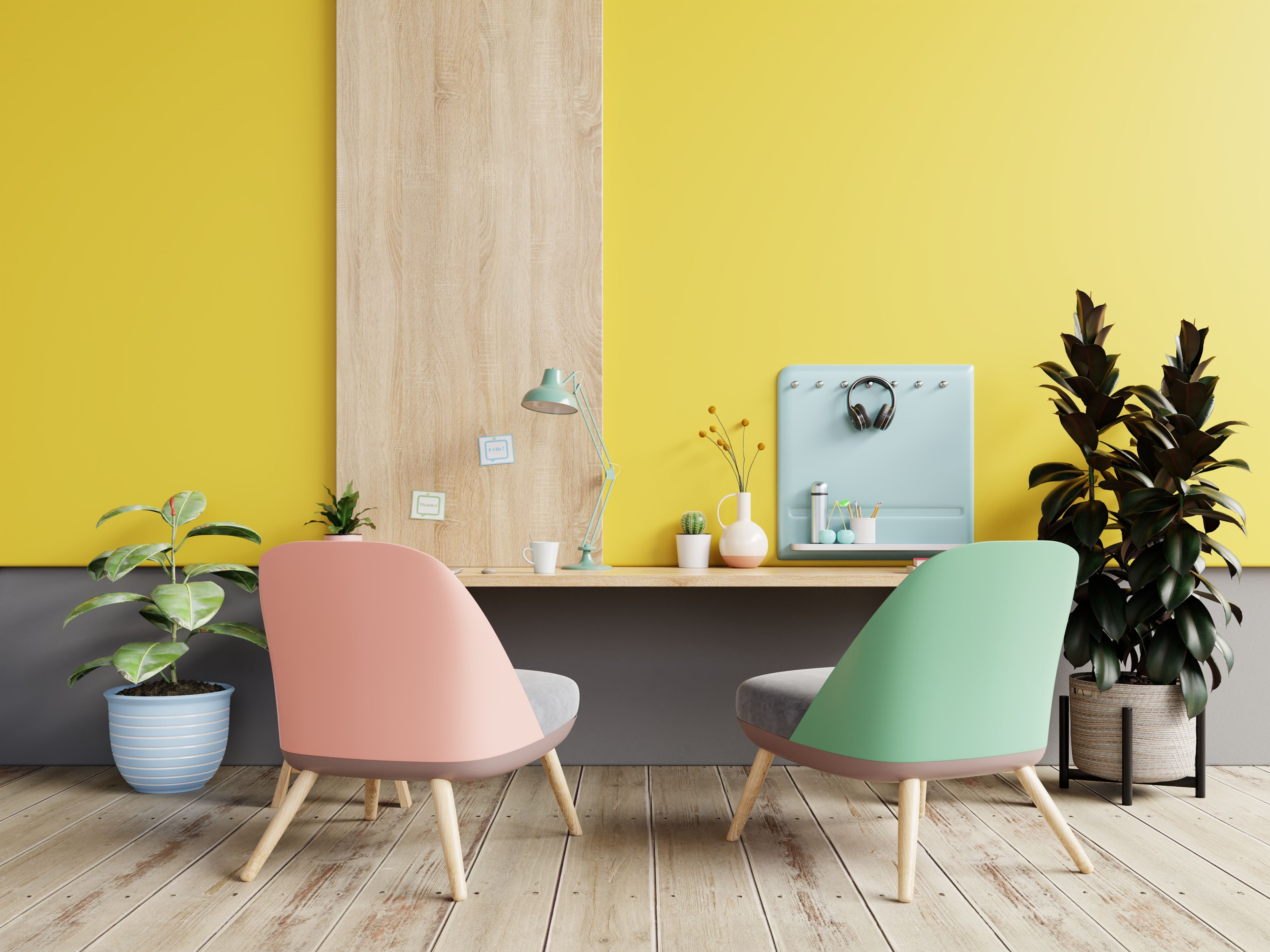
One of the most notable trends is the use of vibrant hues. These colors are not only eye-catching but also energizing, making them perfect for areas where creativity and collaboration are essential. Bright blues, radiant yellows, and vivid greens are increasingly being used to breathe new life into commercial interiors.

Neutral Tones with a Twist
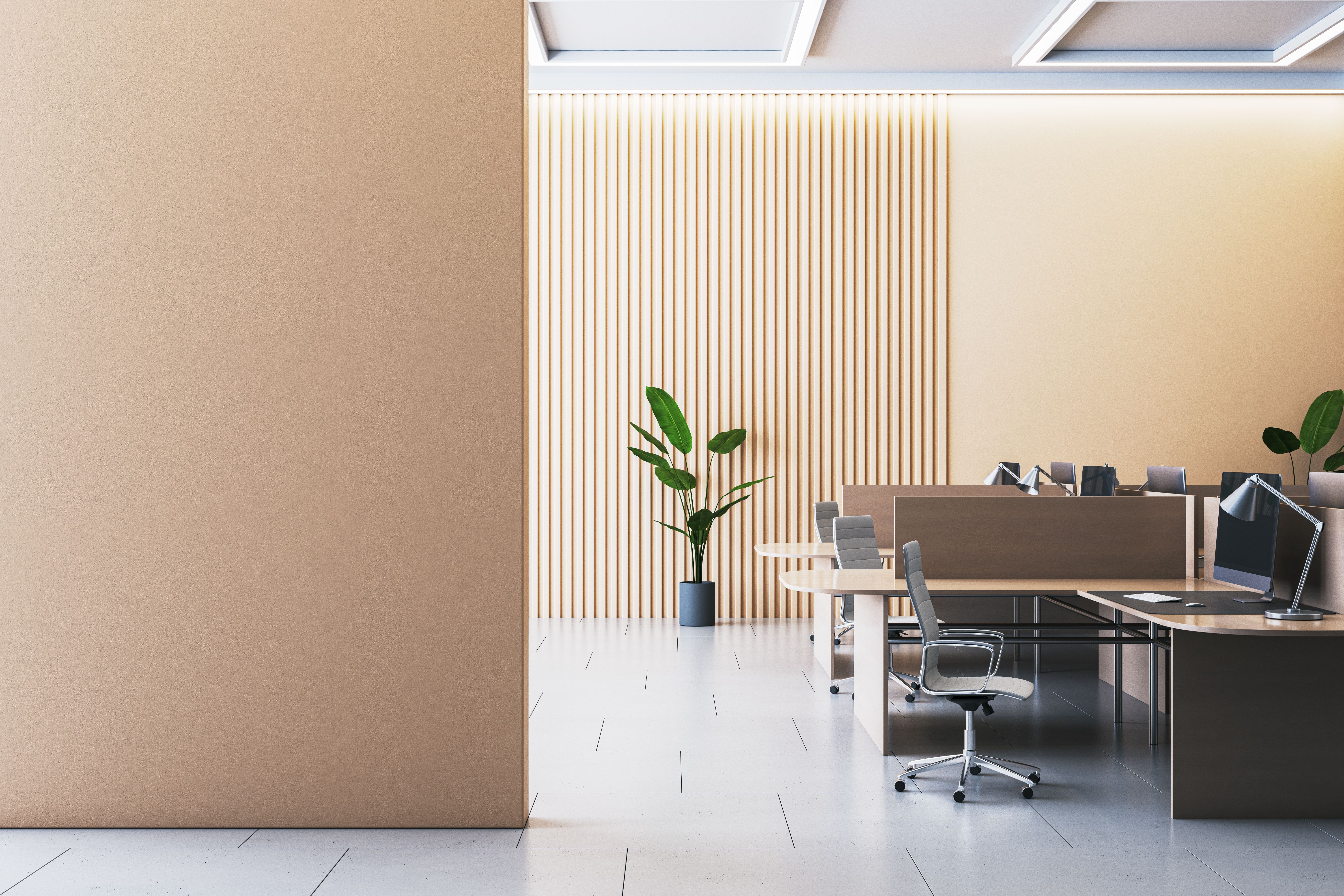
While bold colors are making a splash, neutral tones remain a staple in commercial design due to their versatility. However, the 2020s have seen a shift towards neutrals with a twist. Designers are now incorporating shades like warm taupes, soft greys, and earthy browns that add depth and sophistication without overwhelming the senses.
This approach allows businesses to maintain a professional atmosphere while still injecting personality into their spaces. The subtlety of these hues makes them ideal for creating a calming environment, particularly in areas such as waiting rooms and conference rooms.

Biophilic Design and Nature-Inspired Palettes
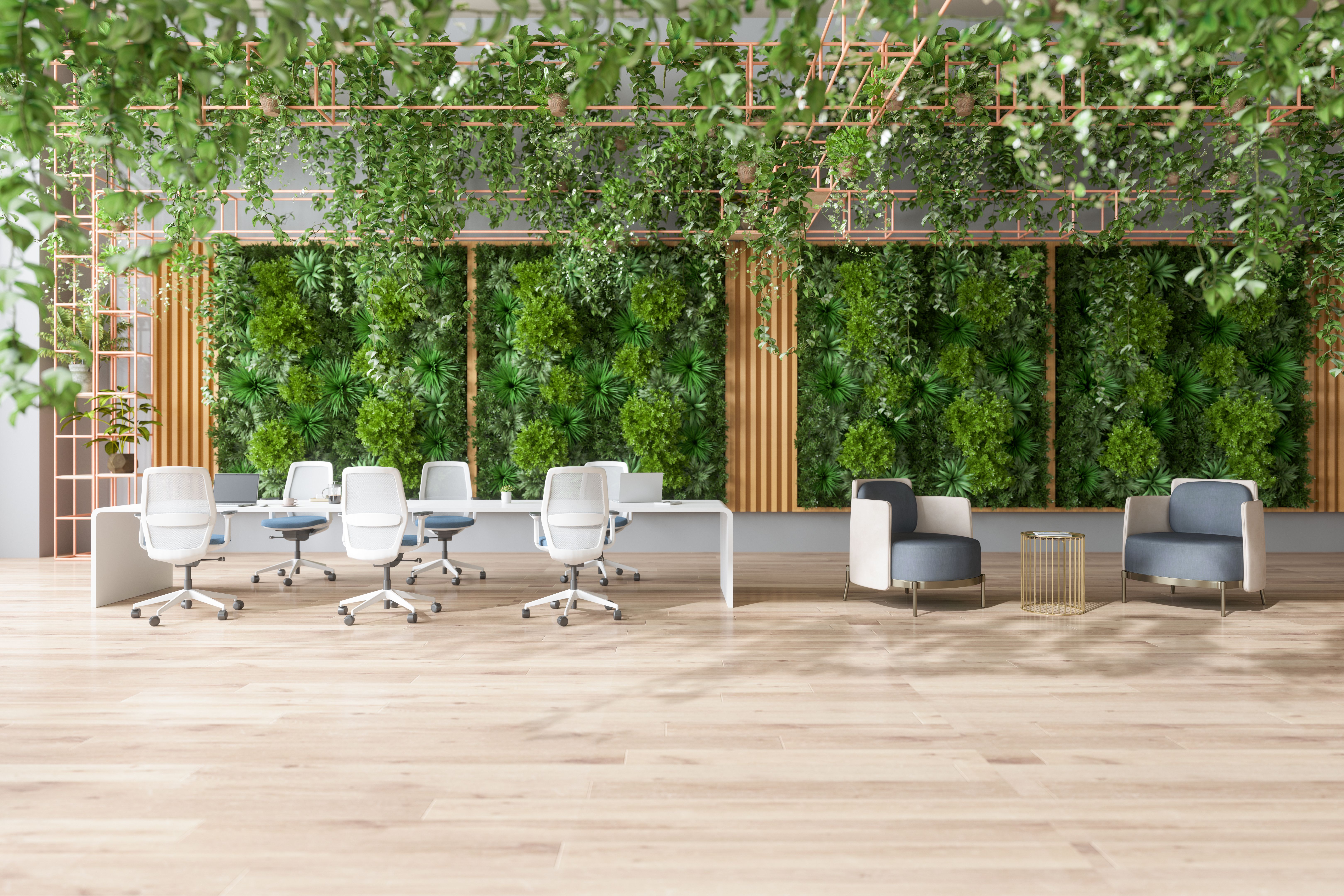
Incorporating elements of nature into commercial spaces has become increasingly popular. Biophilic design focuses on creating a connection between indoor environments and the natural world, which has been shown to improve well-being and productivity.
Nature-inspired color palettes often include greens, browns, and blues, reflecting the earth, sky, and water. These colors not only promote tranquility but also align with sustainable practices that many businesses are adopting. By using these palettes, companies can create harmonious workspaces that resonate with employees and customers alike.

The Rise of Pastels
Soft pastels have made a significant comeback in commercial design, offering a refreshing alternative to traditional color schemes. These gentle hues are particularly favored for their ability to create a sense of openness and lightness within a space.
Pinks, lavenders, and baby blues are being used in everything from feature walls to furnishings. Their soothing nature makes them perfect for areas where relaxation is key, such as lounges or breakout spaces in offices.

Monochromatic Schemes with a Pop
Monochromatic color schemes have long been favored for their elegance and simplicity. However, the 2020s have introduced an exciting twist: adding a pop of color to these otherwise uniform palettes.
This trend involves selecting a base color and using varying shades throughout the space, then introducing an accent color to add interest and contrast. This approach is ideal for businesses looking to make a statement without overwhelming the overall design ethos.
In conclusion, the 2020s are proving to be an exciting time for commercial design, with color playing a pivotal role in transforming spaces. By embracing these latest trends, businesses can create environments that not only look stunning but also enhance the experience for everyone who enters.